Input Data
Part of the power of Plots lies is in the many combinations of allowed input data. You shouldn't spend your time transforming and massaging your data into a specific format. Let Plots do that for you.
There are a few rules to remember, and you'll be a power user in no time.
Inputs are arguments, not keywords
The plot function has several methods: plot(y): treats the input as values for the y-axis and yields a unit-range as x-values. plot(x, y): creates a 2D plot plot(x, y, z): creates a 3D plot
The reason lies in the flexibility of Julia's multiple dispatch, where every combination of input types can have unique behavior, when desired.
Columns are series
In most cases, passing a (n × m) matrix of values (numbers, etc) will create m series, each with n data points. This follows a consistent rule… vectors apply to a series, matrices apply to many series. This rule carries into keyword arguments. scatter(rand(10,4), markershape = [:circle, :rect]) will create 4 series, each assigned the markershape vector [:circle,:rect]. However, scatter(rand(10,4), markershape = [:circle :rect]) will create 4 series, with series 1 and 3 having markers shaped as :circle and series 2 and 4 having markers shaped as :rect (i.e. as squares). The difference is that in the first example, it is a length-2 column vector, and in the second example it is a (1 × 2) row vector (a Matrix).
The flexibility and power of this can be illustrated by the following piece of code:
using Plots

# 10 data points in 4 series
xs = range(0, 2π, length = 10)
data = [sin.(xs) cos.(xs) 2sin.(xs) 2cos.(xs)]

# We put labels in a row vector: applies to each series
labels = ["Apples" "Oranges" "Hats" "Shoes"]

# Marker shapes in a column vector: applies to data points
markershapes = [:circle, :star5]

# Marker colors in a matrix: applies to series and data points
markercolors = [
    :green :orange :black :purple
    :red   :yellow :brown :white
]

plot(
    xs,
    data,
    label = labels,
    shape = markershapes,
    color = markercolors,
    markersize = 10
)
This example plots the four series with different labels, marker shapes, and marker colors by combining row and column vectors to decorate the data.
The following example illustrates how Plots.jl handles: an array of matrices, an array of arrays of arrays and an array of tuples of arrays.
x1, x2 = [1, 0],  [2, 3]    # vectors
y1, y2 = [4, 5],  [6, 7]    # vectors
m1, m2 = [x1 y1], [x2 y2]   # 2x2 matrices

plot([m1, m2])              # array of matrices -> 4 series, plots each matrix column, x assumed to be integer count
plot([[x1,y1], [x2,y2]])    # array of array of arrays -> 4 series, plots each individual array, x assumed to be integer count
plot([(x1,y1), (x2,y2)])    # array of tuples of arrays -> 2 series, plots each tuple as new series
Unconnected Data within same groups
As shown in the examples, you can plot a single polygon by using a single call to plot using the :path line type. You can use several calls to plot to draw several polygons.
Now, let's say you're plotting n polygons grouped into g groups, with n > g. While you can use plot to draw separate polygons with each call, you cannot group two separate plots back into a single group. You'll end up with n groups in the legend, rather than g groups.
To adress this, you can use NaN as a path separator. A call to plot would then draw one path with disjoints The following code draws n=4 rectangles in g=2 groups.
using Plots
plotlyjs()

function rectangle_from_coords(xb,yb,xt,yt)
    [
        xb  yb
        xt  yb
        xt  yt
        xb  yt
        xb  yb
        NaN NaN
    ]
end

some_rects=[
    rectangle_from_coords(1, 1, 5, 5)
    rectangle_from_coords(10, 10, 15, 15)
]
other_rects=[
    rectangle_from_coords(1, 10, 5, 15)
    rectangle_from_coords(10, 1, 15, 5)
]

plot(some_rects[:,1], some_rects[:,2], label = "some group")
plot!(other_rects[:,1], other_rects[:,2], label = "other group")
"input_data_1.png"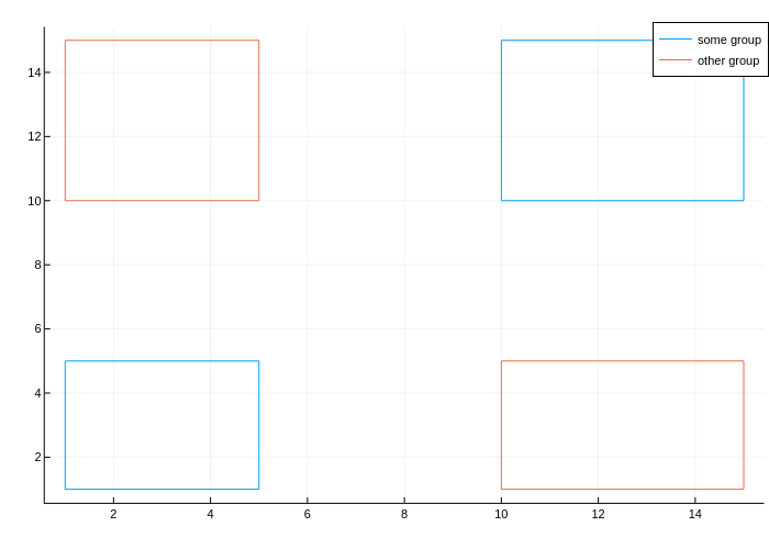
DataFrames support
Using the StatsPlots extension package, you can pass a DataFrame as the first argument (similar to Gadfly or R's ggplot2). For data fields or certain attributes (such as group) a symbol will be replaced with the corresponding column(s) of the DataFrame. Additionally, the column name might be used as the An example:
using StatsPlots, RDatasets
gr()
iris = dataset("datasets", "iris")
@df iris scatter(
    :SepalLength,
    :SepalWidth,
    group = :Species,
    m = (0.5, [:+ :h :star7], 12),
    bg = RGB(0.2, 0.2, 0.2)
)
Functions
Functions can typically be used in place of input data, and they will be mapped as needed. 2D and 3D parametric plots can also be created, and ranges can be given as vectors or min/max. For example, here are alternative methods to create the same plot:
using Plots
tmin = 0
tmax = 4π
tvec = range(tmin, tmax, length = 100)

plot(sin.(tvec), cos.(tvec))
plot(sin, cos, tvec)
plot(sin, cos, tmin, tmax)
Vectors of functions are allowed as well (one series per function).
Images
Images can be directly added to plots by using the Images.jl library. For example, one can import a raster image and plot it with Plots via the commands:
using Plots, Images
img = load("image.png")
plot(img)
PDF graphics can also be added to Plots.jl plots using load("image.pdf"). Note that Images.jl requires that the PDF color scheme is RGB.
Shapes
Save Gotham
using Plots

function make_batman()
    p = [(0, 0), (0.5, 0.2), (1, 0), (1, 2),  (0.3, 1.2), (0.2, 2), (0, 1.7)]
    s = [(0.2, 1), (0.4, 1), (2, 0), (0.5, -0.6), (0, 0), (0, -0.15)]
    m = [(p[i] .+ p[i + 1]) ./ 2 .+ s[i] for i in 1:length(p) - 1]

    pts = similar(m, 0)
    for (i, mi) in enumerate(m)
        append!(
            pts,
            map(BezierCurve([p[i], m[i], p[i + 1]]), range(0, 1, length = 30))
        )
    end
    x, y = Plots.unzip(Tuple.(pts))
    Shape(vcat(x, -reverse(x)), vcat(y, reverse(y)))
end

# background and limits
plt = plot(
    bg = :black,
    xlim = (0.1, 0.9),
    ylim = (0.2, 1.5),
    framestyle = :none,
    size = (400, 400),
    legend = false,
)
# create an ellipse in the sky
pts = Plots.partialcircle(0, 2π, 100, 0.1)
x, y = Plots.unzip(pts)
x = 1.5x .+ 0.7
y .+= 1.3
pts = collect(zip(x, y))

# beam
beam = Shape([(0.3, 0.0), pts[95], pts[50], (0.3, 0.0)])
plot!(beam, fillcolor = plot_color(:yellow, 0.3))" d="M0 1600 L1600 1600 L1600 0 L0 0 Z" fill="%23000000" fill-rule="evenodd" fill-opacity="1"/>
<defs>
<clipPath id="clip091">
<rect x="148" y="47" width="1405" height="1423"/>
</clipPath>
</defs>
<path clip-path="url(%23clip090)" d="M148.274 1469.17 L1552.76 1469.17 L1552.76 47.2441 L148.274 47.2441 Z" fill="%23000000" fill-rule="evenodd" fill-opacity="1"/>
<path clip-path="url(%23clip091)" d="M499.395 1687.93 L1451.83 300.131 L938.428 262.531 L499.395 1687.93 L499.395 1687.93 Z" fill="%23ffff00" fill-rule="evenodd" fill-opacity="0.3"/>
<polyline clip-path="url(%23clip091)" style="stroke:%23ffffff; stroke-linecap:round; stroke-linejoin:round; stroke-width:4; stroke-opacity:1; fill:none" points="499.395,1687.93 1451.83,300.131 938.428,262.531 499.395,1687.93 "/>
</svg>)
# spotlight
plot!(Shape(x, y), c = :yellow)" d="M0 1600 L1600 1600 L1600 0 L0 0 Z" fill="%23000000" fill-rule="evenodd" fill-opacity="1"/>
<defs>
<clipPath id="clip121">
<rect x="148" y="47" width="1405" height="1423"/>
</clipPath>
</defs>
<path clip-path="url(%23clip120)" d="M148.274 1469.17 L1552.76 1469.17 L1552.76 47.2441 L148.274 47.2441 Z" fill="%23000000" fill-rule="evenodd" fill-opacity="1"/>
<path clip-path="url(%23clip121)" d="M499.395 1687.93 L1451.83 300.131 L938.428 262.531 L499.395 1687.93 L499.395 1687.93 Z" fill="%23ffff00" fill-rule="evenodd" fill-opacity="0.3"/>
<polyline clip-path="url(%23clip121)" style="stroke:%23ffffff; stroke-linecap:round; stroke-linejoin:round; stroke-width:4; stroke-opacity:1; fill:none" points="499.395,1687.93 1451.83,300.131 938.428,262.531 499.395,1687.93 "/>
<path clip-path="url(%23clip121)" d="M1464.98 266.002 L1464.45 259.064 L1462.86 252.155 L1460.22 245.302 L1456.54 238.531 L1451.83 231.872 L1446.11 225.35 L1439.41 218.991 L1431.76 212.822 L1423.17 206.867 L1413.7 201.15 L1403.37 195.694 L1392.22 190.522 L1380.31 185.653 L1367.69 181.108 L1354.39 176.904 L1340.48 173.06 L1326 169.589 L1311.03 166.507 L1295.62 163.826 L1279.83 161.556 L1263.72 159.706 L1247.36 158.285 L1230.82 157.297 L1214.17 156.747 L1197.46 156.637 L1180.77 156.967 L1164.16 157.736 L1147.7 158.941 L1131.46 160.578 L1115.51 162.639 L1099.9 165.116 L1084.69 167.999 L1069.97 171.277 L1055.77 174.936 L1042.15 178.962 L1029.18 183.339 L1016.91 188.048 L1005.38 193.071 L994.636 198.388 L984.728 203.977 L975.694 209.816 L967.569 215.881 L960.387 222.148 L954.177 228.592 L948.962 235.186 L944.765 241.904 L941.603 248.72 L939.488 255.604 L938.428 262.531 L938.428 269.472 L939.488 276.399 L941.603 283.284 L944.765 290.099 L948.962 296.817 L954.177 303.411 L960.387 309.855 L967.569 316.122 L975.694 322.187 L984.728 328.026 L994.636 333.615 L1005.38 338.932 L1016.91 343.955 L1029.18 348.665 L1042.15 353.041 L1055.77 357.067 L1069.97 360.726 L1084.69 364.004 L1099.9 366.888 L1115.51 369.365 L1131.46 371.425 L1147.7 373.062 L1164.16 374.267 L1180.77 375.036 L1197.46 375.367 L1214.17 375.256 L1230.82 374.706 L1247.36 373.719 L1263.72 372.297 L1279.83 370.448 L1295.62 368.178 L1311.03 365.496 L1326 362.414 L1340.48 358.944 L1354.39 355.099 L1367.69 350.896 L1380.31 346.35 L1392.22 341.482 L1403.37 336.309 L1413.7 330.853 L1423.17 325.136 L1431.76 319.181 L1439.41 313.012 L1446.11 306.654 L1451.83 300.131 L1456.54 293.472 L1460.22 286.702 L1462.86 279.848 L1464.45 272.939 L1464.98 266.002 L1464.98 266.002 Z" fill="%23ffff00" fill-rule="evenodd" fill-opacity="1"/>
<polyline clip-path="url(%23clip121)" style="stroke:%23ffffff; stroke-linecap:round; stroke-linejoin:round; stroke-width:4; stroke-opacity:1; fill:none" points="1464.98,266.002 1464.45,259.064 1462.86,252.155 1460.22,245.302 1456.54,238.531 1451.83,231.872 1446.11,225.35 1439.41,218.991 1431.76,212.822 1423.17,206.867 1413.7,201.15 1403.37,195.694 1392.22,190.522 1380.31,185.653 1367.69,181.108 1354.39,176.904 1340.48,173.06 1326,169.589 1311.03,166.507 1295.62,163.826 1279.83,161.556 1263.72,159.706 1247.36,158.285 1230.82,157.297 1214.17,156.747 1197.46,156.637 1180.77,156.967 1164.16,157.736 1147.7,158.941 1131.46,160.578 1115.51,162.639 1099.9,165.116 1084.69,167.999 1069.97,171.277 1055.77,174.936 1042.15,178.962 1029.18,183.339 1016.91,188.048 1005.38,193.071 994.636,198.388 984.728,203.977 975.694,209.816 967.569,215.881 960.387,222.148 954.177,228.592 948.962,235.186 944.765,241.904 941.603,248.72 939.488,255.604 938.428,262.531 938.428,269.472 939.488,276.399 941.603,283.284 944.765,290.099 948.962,296.817 954.177,303.411 960.387,309.855 967.569,316.122 975.694,322.187 984.728,328.026 994.636,333.615 1005.38,338.932 1016.91,343.955 1029.18,348.665 1042.15,353.041 1055.77,357.067 1069.97,360.726 1084.69,364.004 1099.9,366.888 1115.51,369.365 1131.46,371.425 1147.7,373.062 1164.16,374.267 1180.77,375.036 1197.46,375.367 1214.17,375.256 1230.82,374.706 1247.36,373.719 1263.72,372.297 1279.83,370.448 1295.62,368.178 1311.03,365.496 1326,362.414 1340.48,358.944 1354.39,355.099 1367.69,350.896 1380.31,346.35 1392.22,341.482 1403.37,336.309 1413.7,330.853 1423.17,325.136 1431.76,319.181 1439.41,313.012 1446.11,306.654 1451.83,300.131 1456.54,293.472 1460.22,286.702 1462.86,279.848 1464.45,272.939 1464.98,266.002 "/>
</svg>)
# buildings
rect(w, h, x, y) = Shape(x .+ [0, w, w, 0, 0], y .+ [0, 0, h, h, 0])
gray(pct) = RGB(pct, pct, pct)
function windowrange(dim, denom)
    range(0, 1, length = max(3, round(Int, dim/denom)))[2:end - 1]
end

for k in 1:50
    local w, h, x, y = 0.1rand() + 0.05, 0.8rand() + 0.3, rand(), 0.0
    shape = rect(w, h, x, y)
    graypct = 0.3rand() + 0.3
    plot!(shape, c = gray(graypct))

    # windows
    I = windowrange(w, 0.015)
    J = windowrange(h, 0.04)
    local pts = vec([(Float64(x + w * i), Float64(y + h * j)) for i in I, j in J])
    windowcolors = Symbol[rand() < 0.2 ? :yellow : :black for i in 1:length(pts)]
    scatter!(pts, marker = (stroke(0), :rect, windowcolors))
end
plt
# Holy plotting, Batman!
batman = Plots.scale(make_batman(), 0.07, 0.07, (0, 0))
batman = translate(batman, 0.7, 1.23)
plot!(batman, fillcolor = :black)
Extra keywords
There are some features that are very specific to a certain backend or not yet implemented in Plots. For these cases it is possible to forward extra keywords to the backend. Every keyword that is not a Plots keyword will then be collected in a extra_kwargs dictionary.
This dictionary has three layers: :plot, :subplot and :series (default). To which layer the keywords get collected can be specified by the extra_kwargs keyword. If arguments should be passed at multiple layers in the same call or the keyword is already a valid Plots keyword, the extra_kwargs dictionary has to be constructed at the call site.
plot(1:5, series_keyword = 5)
# results in extra_kwargs = Dict( :series => Dict( series_keyword => 5 ) )
plot(1:5, colormap_width = 6, extra_kwargs = :subplot)
# results in extra_kwargs = Dict( :subplot => Dict( colormap_width = 6 ) )
plot(1:5, extra_kwargs = Dict( :series => Dict( series_keyword => 5 ), :subplot => Dict( colormap_width => 6 ) ) )
Refer to the tracking issue to see for which backends this feature is implemented. Which extra keywords the backend actually handles should be documented in the backend documentation.